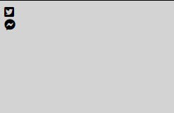
Neumorphic social buttons


Neumorphic social buttons
Want to try the trending design? just play around with the box-shadow property, which is simple, indeed!
Here I'm using font awesome icons 👇 this is the link tag for font awesome icon just add this tag in your html file
<link rel="stylesheet" href="https://cdnjs.cloudflare.com/ajax/libs/font-awesome/5.15.2/css/all.min.css" integrity="sha512-HK5fgLBL+xu6dm/Ii3z4xhlSUyZgTT9tuc/hSrtw6uzJOvgRr2a9jyxxT1ely+B+xFAmJKVSTbpM/CuL7qxO8w==" crossorigin="anonymous" />
Let's create a div with the class of icons, and nested div with class of icon
<div class="icons">
    <div class=icon>
        <a href="#"><i class="fab fa-twitter"></i></a>
    </div>
  <div class=icon>
        <a href="#"><i class="fab fa-facebook-messenger"></i></a>
    </div>
</div>
Let's style this the outer div
box-shadow property plays a vital role in designing the neuromorphic designs, therefore concentrate more on this and play around with different values, for instance try inset box-shadow
body{
 background: rgb(235, 235, 235);
}
.icons {
  display: grid;
  grid-template-columns: repeat(2, 1fr);
  grid-gap: 1rem;
  width: 230px;
  box-shadow: -3px -3px 5px rgba(255, 255, 255, 5),
    3px 3px 5px rgba(0, 0, 0, 0.2);
  padding: 2rem;
  border-radius: 10px;
  text-align: center;
}
Now lets style the inner div
.icon {
  box-shadow: -3px -3px 5px rgba(255, 255, 255, 5),
    3px 3px 5px rgba(0, 0, 0, 0.1);
  border-radius: 10px;
  padding: 0.25rem;
  transition: all 0.3s ease;
}

For more realistic experience add hover effects
.icon:hover {
  cursor: pointer;
  transform: scale(1.1);
}
.icon:active {
  transform: scale(1.02);
}
So that's it for now, hope you would like it!
Codepen 👉 Codepen
GitHub repo👉 GitHub